Annika Tara
A relational life coach in the United States, whose own words were already good. The work was to build something that sounded like her instead of like a coaching template.
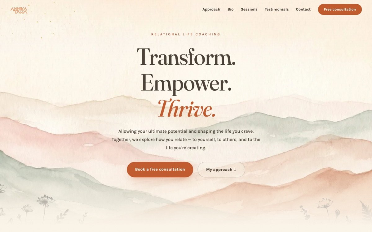
Her voice already
existed.
Some clients need help finding out what they sound like. Annika did not. Her language was already precise — Transform. Empower. Thrive. · witness, reflect, cultivate · nature connection, embodiment, relational awareness.
So the discipline was restraint: keep every word of it verbatim, and build something the words could live inside. No invented whimsy, no smoothing her phrasing into the beige register that coaching websites drift toward.
Built in Germany,
for a US practice.
Her logo and portrait were hers and stayed untouched — never regenerated, never "improved". Prices in dollars, a US footer, US booking conventions. Everything built and tested from six thousand kilometres away.
Where artwork was needed it was generated to match what already existed — botanical medallions and approach icons drawn into her palette rather than borrowed from a library.
Six pages that
hold their nerve.
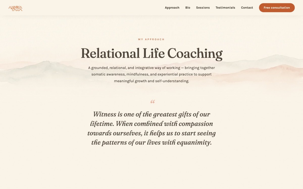
A landing page, her approach, her bio, two session pages and a free consultation. Fraunces and Karla, a paper grain barely there, and a great deal of air — because the work she does needs room around it.
Booking, payment,
and no platform fee.
- A booking calendar for the free consultation, embedded directly — no redirect to somebody else's branded page.
- A contact form that works on static hosting, with no server to maintain and nothing to keep patched.
- Card payments staged against each session type, ready to switch on.
- Testimonials left deliberately empty until real ones exist. Inventing them was never on the table.
Her site is mid-update, so the link above points at the preview build rather than the live domain.